前言
大数据时代,大屏数据展示的需求日益增加,很多政府单位或企业会使用数据大屏进行报表展示、业务监控等。因此,出于学习和实践的目的,完成了一个简单的大屏可视化项目。
效果展示
线上地址
源码链接

技术栈
React、ReactRouter、Echarts
实现过程
该项目的实现主要是解决了以下问题:
如何进行屏幕适配
大屏适配公式
首先要考虑的问题是,数据展示区域的宽高如何计算,如何使画面在不同设备下都能居中?
假设设计稿的比例为16:9,那么页面在设备中的布局应该有如下两种情况:
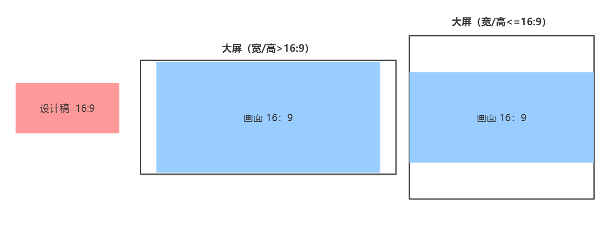
根据示意图可得,如果设备宽高比<=16:9,那么页面宽度应该就是设备宽度;如果宽高比 >16:9,那么页面宽度应为设备高度 * 16/9,页面高度根据页面宽度换算,具体计算公式如下:

- Wp 为页面有效宽度,Hp 为页面有效高度
- 页面左右居中,上下居中,四周留白
代码如下:
1
2
3
4
5
6
7
8
9
10
11
12
13
14
15
16
17
18
19
20
21
22
23
24
25
26
27
| <!DOCTYPE html>
<html lang="zh">
<head>
<meta charset="UTF-8"/>
<meta name="viewport"
content="width=device-width,initial-scale=1,minimum-scale=1,maximum-scale=1,user-scalable=no,viewport-fit=cover">
<title>大屏可视化项目</title>
<script>
const clientWidth = document.documentElement.clientWidth;
const clientHeight = document.documentElement.clientHeight;
const screenScale = clientWidth / clientHeight
const scale = 16 / 9
window.pageWidth = screenScale > scale ? clientHeight * scale : clientWidth;
const pageHeight = pageWidth / scale
</script>
</head>
<body>
<div id="root"></div>
<script>
root.style.width = pageWidth + 'px'
root.style.height = pageHeight + 'px'
root.style.marginTop =( clientHeight - pageHeight)/2 + 'px'
</script>
<script type="module" src="/src/main.tsx"></script>
</body>
</html>
|
1
2
3
4
5
| #root {
margin: auto;
display: flex;
flex-direction: column;
}
|
rem计算公式
解决完页面与屏幕的适配问题,接下来需要解决的就是如何适配一个div,即设计稿上一个div的尺寸如何换算成页面上的尺寸?
常见的方法就是使用rem适配 —> 根据页面宽度规定1rem的大小,然后根据设计稿尺寸和页面尺寸进行换算。
因此,首先在head里,设置1rem = Wp / 100
1
2
3
4
| const string = `<style>html {
font-size: ${pageWidth / 100}px
}</style>`
document.write(string)
|
然后得到计算公式如下:

根据该计算公式可封装将px换算为rem的函数:
1
2
3
4
5
6
7
8
9
10
11
| @function px($n){
@return $n / 2420 * 100rem
}
// 使用时只需将设计稿上的像素尺寸传入即可
header {
margin: 0 auto;
width: px(2420);
height: px(102);
background-size: cover;
}
|
如何进行页面布局
解决了适配的问题,接下来就是页面布局啦。
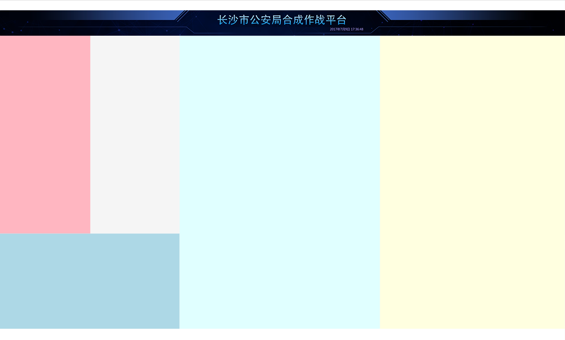
因为设计稿的布局比较规整,所以先用grid布局将其初步分成了五个部分:
1
2
3
4
5
6
7
8
9
10
11
12
13
14
15
16
17
18
|
import headerBg from '../static/images/header.png'
export const Home = () => {
return (
<div className="home">
<header style={{backgroundImage: `url(${headerBg})`}}></header>
<main>
<section className="section1"></section>
<section className="section2"></section>
<section className="section3"></section>
<section className="section4"></section>
<section className="section5"></section>
</main>
</div>
);
};
|
1
2
3
4
5
6
7
8
9
10
11
12
13
14
15
16
17
18
19
20
21
22
23
24
25
26
27
28
29
30
31
32
33
34
35
36
37
38
39
40
|
@import "../shared/helper";
.home {
flex: 1;
display: flex;
flex-direction: column;
> header {
height: px(102);
background-size: cover;
}
> main {
flex: 1;
display: grid;
grid-template:
"box1 box2 box4 box5" 755fr
"box3 box3 box4 box5" 363fr / 366fr 361fr 811fr 747fr;
> .section1 {
grid-area: box1;
background: lightpink;
}
> .section2 {
grid-area: box2;
background: whitesmoke;
}
> .section3 {
grid-area: box3;
background: lightblue;
}
> .section4 {
grid-area: box4;
background: lightcyan;
}
> .section5 {
grid-area: box5;
background: lightyellow;
}
}
}
|
完成了基础的布局,才能继续进行背景和边框等细节优化,以及图表的填充。
Echarts的使用
引入Echarts
添加第一个柱状图
1
2
3
4
5
6
7
8
9
10
11
12
13
14
15
16
17
18
19
20
21
22
23
24
25
26
27
28
29
30
31
32
33
34
35
36
37
38
39
40
41
42
43
44
45
46
47
48
49
50
51
52
53
54
55
56
57
58
59
60
61
62
63
64
65
66
67
68
69
70
71
72
73
74
75
76
77
78
| import React, {useEffect, useRef} from 'react';
import './home.scss';
import headerBg from '../static/images/header.png'
import * as echarts from 'echarts';
const px = (n) => n / 2420 * (window as any).pageWidth;
export const Home = () => {
const divRef = useRef(null)
useEffect(() => {
let myChart = echarts.init(divRef.current);
myChart.setOption({
textStyle: {
fontSize: px(12),
color: '#79839E'
},
title: {show: false},
legend: {show: false},
xAxis: {
data: ['芙蓉新区', '芙蓉新区', '芙蓉新区', '芙蓉新区', '芙蓉新区', '芙蓉新区', '芙蓉新区', '芙蓉新区', '芙蓉新区'],
axisTick: {show: false},
axisLine: {
lineStyle: {color: '#083B70'}
},
axisLabel: {
fontSize: px(12),
formatter(val) {
if (val.length > 2) {
const array = val.split('');
array.splice(2, 0, '\n');
return array.join('');
} else {
return val;
}
}
},
},
grid: {
x: px(40),
y: px(40),
x2: px(40),
y2: px(40),
},
yAxis: {
splitLine: {show: false},
axisLine: {
show: true,
lineStyle: {color: '#083B70'}
},
axisLabel: {
fontSize: px(12)
}
},
series: [{
type: 'bar',
data: [10, 20, 36, 41, 15, 26, 37, 18, 29]
}]
});
}, []);
return (
<div className="home">
<header style={{backgroundImage: `url(${headerBg})`}}></header>
<main>
<section className="section1">
<div className="bordered 管辖统计">
<h2>案发派出所管辖统计</h2>
<div ref={divRef} className="chart">
</div>
</div>
</section>
<section className="section2 bordered"></section>
<section className="section3 bordered"></section>
<section className="section4 bordered"></section>
<section className="section5 bordered"></section>
</main>
</div>
);
|
重构和封装
因图表的文字样式、x轴、y轴等配置需要统一,所以将Echarts的配置进行了一次封装,同时还封装了尺寸换算的函数
1
2
|
export const px = (n) => n / 2420 * (window as any).pageWidth;
|
1
2
3
4
5
6
7
8
9
10
11
12
13
14
15
16
17
18
19
20
21
22
|
import {px} from './px';
export const baseEchartOptions = {
textStyle: {
fontSize: px(12),
color: '#79839E'
},
title: {show: false},
legend: {show: false},
grid: {
x: px(20),
y: px(20),
x2: px(20),
y2: px(20),
containLabel: true
},
};
|
1
2
3
4
5
6
7
8
9
10
11
12
13
14
15
16
17
18
19
20
21
22
23
24
25
|
import {baseEchartOptions} from './base-echart-options';
import {px} from './px';
export const createEchartsOptions = (options) => {
const result = {
...baseEchartOptions,
...options,
};
if (!(options?.xAxis?.axisLabel?.fontSize)) {
result.xAxis = result.xAxis || {};
result.xAxis.axisLabel = result.xAxis.axisLabel || {};
result.xAxis.axisLabel.fontSize = px(12);
}
if (!(options?.yAxis?.axisLabel?.fontSize)) {
result.yAxis = result.yAxis || {};
result.yAxis.axisLabel = result.yAxis.axisLabel || {};
result.yAxis.axisLabel.fontSize = px(12);
}
return result;
};
|
重构后的chart1
1
2
3
4
5
6
7
8
9
10
11
12
13
14
15
16
17
18
19
20
21
22
23
24
25
26
27
28
29
30
31
32
33
34
35
36
37
38
39
40
41
42
43
44
45
46
47
48
49
50
51
52
| import React, {useEffect, useRef} from 'react';
import * as echarts from 'echarts';
import {px} from '../shared/px';
import {baseEchartOptions} from '../shared/base-echart-options';
import {createEchartsOptions} from '../shared/create-echarts-options';
export const Chart1 = () => {
const divRef = useRef(null);
useEffect(() => {
let myChart = echarts.init(divRef.current);
myChart.setOption(createEchartsOptions({
xAxis: {
data: ['芙蓉新区', '芙蓉新区', '芙蓉新区', '芙蓉新区', '芙蓉新区', '芙蓉新区', '芙蓉新区', '芙蓉新区', '芙蓉新区'],
axisTick: {show: false},
axisLine: {
lineStyle: {color: '#083B70'}
},
axisLabel: {
formatter(val) {
if (val.length > 2) {
const array = val.split('');
array.splice(2, 0, '\n');
return array.join('');
} else {
return val;
}
}
},
},
yAxis: {
splitLine: {show: false},
axisLine: {
show: true,
lineStyle: {color: '#083B70'}
},
},
series: [{
type: 'bar',
data: [10, 20, 36, 41, 15, 26, 37, 18, 29]
}]
}));
}, []);
return (
<div className="bordered 管辖统计">
<h2>案发派出所管辖统计</h2>
<div ref={divRef} className="chart">
</div>
</div>
);
};
|
